Your pocket-sized personal assistant and delivery partner.
Visit
Dunzo is an app that offers pickup and drop facilities, whether it be medicines from a pharmacy or sending your friend a special gift. Though they began with a personal assistant facility, they have now expanded to offer other delivery services including food and grocery delivery.

The Brief
Imagine your in-laws call to tell you that they are coming to visit you in two days. From deep cleaning the entire house to repairs and stocking the fridge with groceries, Dunzo is your answer! All you have to do is use the Dunzo app to set up appointments for all of your tasks. Finding a plumber, grocery shopping and cleaning services are all just a few clicks away.
Dunzo is your very own butler! With a machine-learning engine that identifies tasks automatically and proactively suggests next steps, you can be assured that the app is only going to get better with every task.
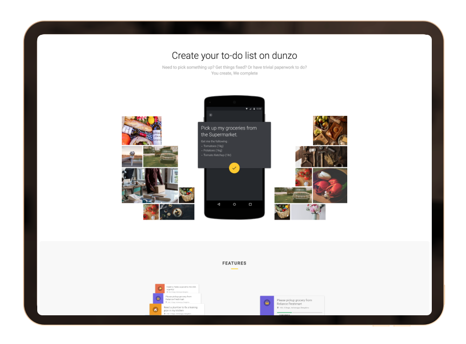
When Dunzo first started, it was a service built on top of WhatsApp. While early adopters loved the low-friction way to get boring chores done, the offline work for the company was quite another story. It was arduous for the company to keep track of tasks without custom-built infrastructure. Many of the features they wanted to introduce (like lists, geo-tracking, and varied payment options) weren’t possible to have on WhatsApp. This led to slow response times, burned-out operators and eventually a dip in customer satisfaction metrics. They needed a custom app.
By this point, the company had narrowed in on what they needed in an app. They approached us in early 2015, and since we were enthusiastic and existing users, we were thrilled to be a part of shaping their journey. We are proud to have been a part of building easier, better and faster ways to help everyone check tasks off their lists.
Strategy
Every so often, along comes a service that completely rewrites the way we live our lives — and Dunzo did just that! The brand is all about efficiency and getting things ‘Dun’ and our team aimed to emphasise these distinct features of the company. The Dunzo team had figured out exactly what they needed from an app. They came to us with a laundry list of demands and we found a way to make the best version of what they needed. We had a lot to figure out.
Some key focus areas were:
- Creating an efficient and distinct flow to minimise miscommunication
- Providing as much data about tasks to ensure both parties were on the same page
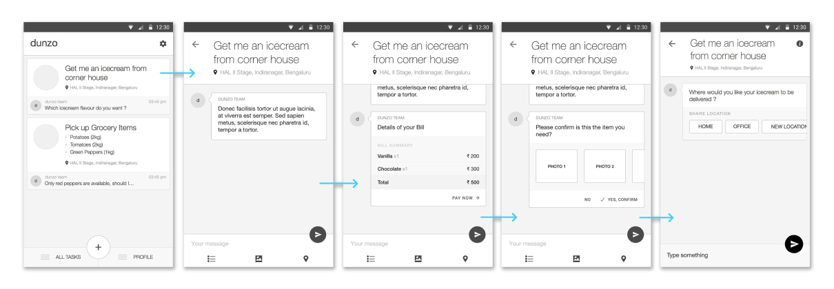
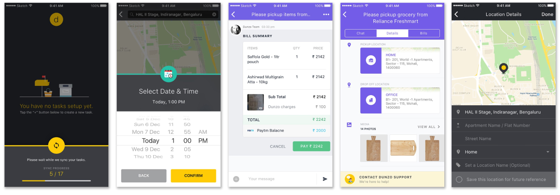
We worked heavily on creating the different task flows. Digitising bills, cross-checking final values and confirmation of available items were just some of the prioritised features we worked on that made it into the final app.
One of the focal points was making every flow easy to understand, effective and efficient. The app had to work flawlessly with minimal information and instructions while creating a task, to keep the process a hassle-free experience for customers (as well as delivery executives).
Design
Once we had the strategy in place, we began on the design. The first step was to develop the visual language. Dunzo was such a unique and helpful idea, and we wanted that to translate in the design. Just like the brand, we wanted an interface that stands apart from anything else that was available in the market at the time.
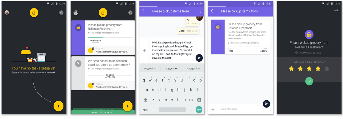
The look and feel of the app was made to be distinctive, and a platform-independent look. We played with colours extensively before we settled on a black palette with pops of vivid colour. The dark theme helped make it look subtle and sophisticated (just like one would expect of a butler).


The USPs
- Flow-focused app and website that made it easy to book tasks
- Easy-to-understand and efficient UI and UX to minimise the need for customer support
More Projects


