Healthy & clean living brought to life.
VisitVibrant Living is a healthy and clean snack and staple company that offers natural and organic alternatives to diet-conscious people. Without compromising on taste, and by giving special attention to nutritional value, their foods are healthy and delicious.
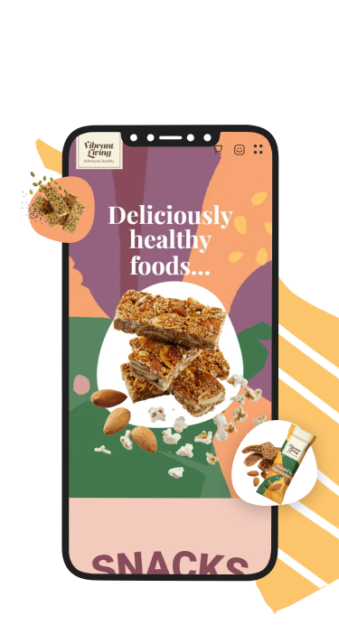
Vibrant Living is a healthy and clean snack and staple company that offers natural and organic alternatives to diet-conscious people. Without compromising on taste, and by giving special attention to nutritional value, their foods are healthy and delicious.
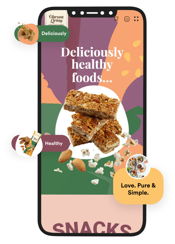

The Brief
Upon considering a revamp, Vibrant Living came to us to redesign and develop their new and improved website, as well as rebrand their aesthetic.
The VL team was having trouble with their previous website and was keen to have a fresh start with regard to both the brand and website. The previous website was buggy and had concerns with the backend, especially with order issues. The order management and logistics flows needed to be smooth and hiccup-free.


Strategy
From starting as a small physical store Vibrant Living has grown manifold and the website and branding were to reflect that. The new website was meant to act as a fully functioning e-commerce store.
The first step was designing a UI and UX that had everything the VL teams and their customers would need. We carefully designed and thought out a website that offers a comfortable shopping experience with attractive visual elements that make it memorable and fun. The website was to highlight the Hyderabad-based store, which was where the brand had its humble beginnings.
VL also offers a daily healthy meal delivery service which was part of the previous website, but now acts as a separate website and subscription service.
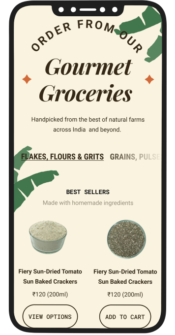
One of their most popular products is their ‘staples’, which consist of common grocery ingredients like pulses and grains. When designing we ensured this section was given particular focus.
An important part of the rebrand and website revamp was to improve their order management, website analytics and customer service experiences.
The target audience for each section could be quite varied. For example, a homemaker and mother may prefer the staples section while a teenage fitness enthusiast may opt for the snacks one. We wanted each section to stand out from the others and cater to the kind of audience and products it offers. Every section on the website has a personality of its own and they function a bit differently from one another.

Design
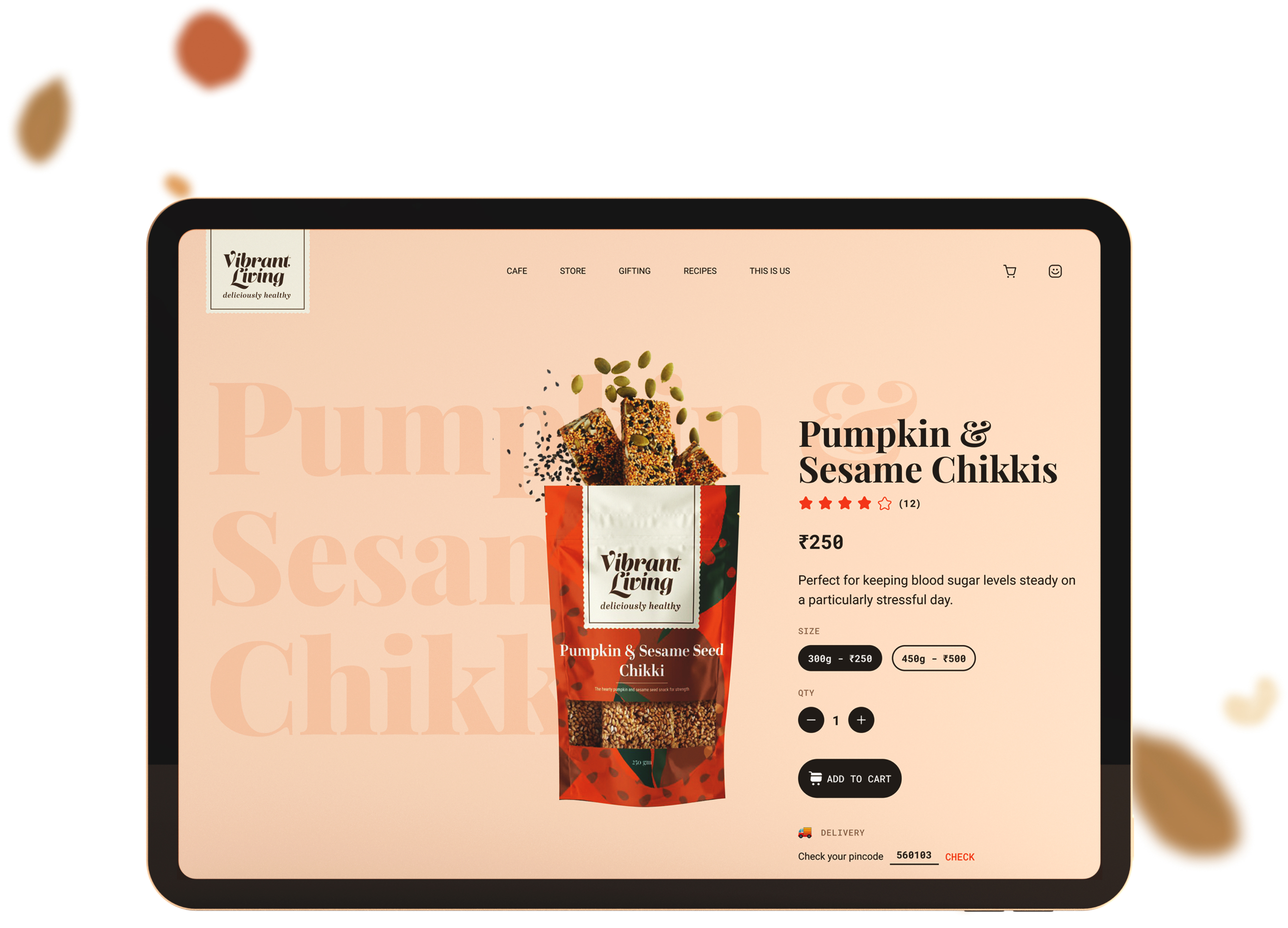
We were very mindful while working on rebranding. We used vibrant colours that speak to the name of the brand. As VL is a healthy food and better living brand, the colours chosen were lively and enticing. Fruity pastels make up the main colour palette, while other colour splashes mirror the ingredients. Green leaves indicate vegetables, yellow specks stand for seeds and so on. The design elements, colours and shapes used were carefully chosen to mirror the products and brand identity.
The website is laid out in a simple and comfortable manner. The homepage has all the sections and products that are most popular like ‘Snacks’ and ‘Staples’. The bestsellers are highlighted on the homepage so new customers can choose recommended products.
As the purpose of Vibrant Living is mindful and healthy eating it was important to highlight the nutritional information of each product including macros, quantity, and ingredients. Every product section uses cards to showcase the details - the card flips upon clicking and offers important product details.
You can further visit the product page for more information or add the item to your cart using the buttons on the card. In order to allow customers to compare nutritional values and prices, multiple cards can be opened at a time.
A section they wants us to pay attention to was ‘Recipes and Blogs’. It helps users understand how each ingredient can be used and its benefits. This helps the brand encourage customers to choose staples and allows for cross-linking.
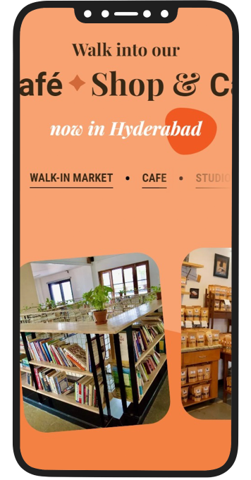
A section on the homepage directs the customer to their Hyderabad store - for those that prefer an in-person shopping experience. A powerful and bold scrolling title grabs the attention of the user directing their attention to this section.
The menu on the website is not static and changes as you navigate into different sections. If you are in the ‘Snacks’ section it is quick and convenient to navigate to the ‘Ready-to make’ snacks or the ‘pickles & porridges’ sections.
All pages have related products below for interested customers to quickly navigate and find similar products that can be used in tandem.
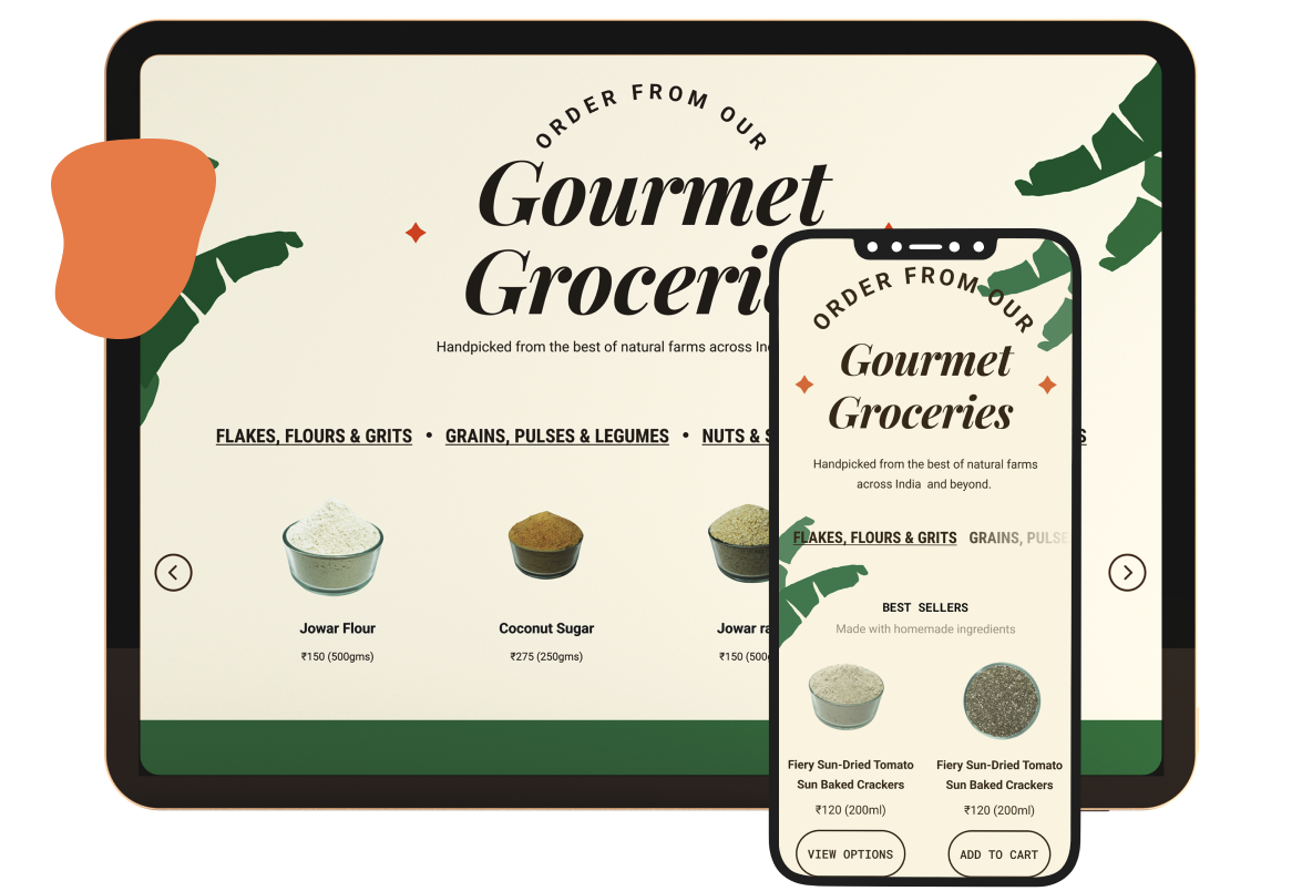


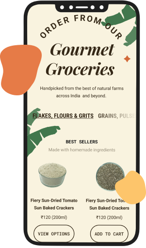
Development
It was important to the brand that we make the website as vibrant and interesting as possible. The website has some unique and fun animations where the products and imagery moves with you as you navigate the site.
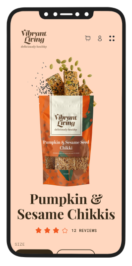
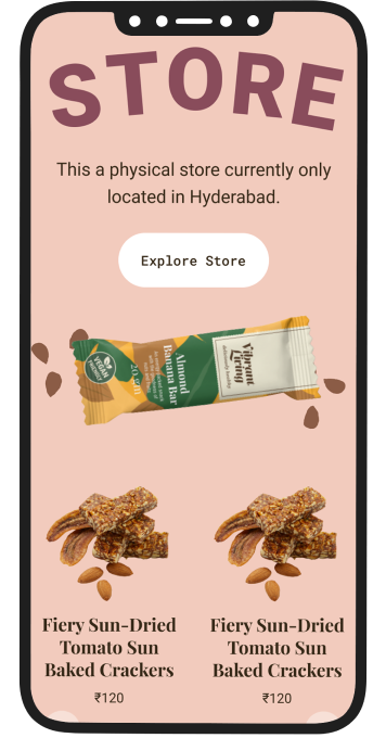
The ‘Snacks’ page animation is completely customised with the snack jumping out of the bag and travelling with a customer as they scroll through the page, finally landing in one of the sections below.
Due to the fact that there were a lot of customsations and product information required, we decided to build the Vibrant Living website on Apex. This e-commerce platform allows us to make the designs much more adaptive and intuitive. As the VL team wanted a smooth-functioning and organised backend and CMS, Apex was an ideal option.
All the pages have a section with videos that connect to the particular product. These are connected to their youtube channel that will have behind the scenes footage, recipes and other VL-related videos.
As customer support was to be highlighted we opted to have a live chat on the website.
Any information one would need to make an informed decision on a product is presented to them in a convenient manner.
Project highlights

 As the target audience is health-conscious folk or those that are looking to change
their diet and nutrition, the website focuses on the health benefits and nutritional
values every step of the way.
 The backend functions seamlessly with features like preorder management, sale/campaign
management, and analytics (apart from the standard order and logistics management)
 Specially designed animations and transitions that create a distinct user journey and
experience, enticing and encouraging customers to make a purchase.
More Projects
